This week’s post is inspired by Twitter (does anyone unironically call it X? the domain is still Twitter).
Anyway. Twitter is our favorite place to consume unhinged takes on the economy. And one of the consistent crimes we see there is terrible charts. Not just charts that are poorly designed, but charts that require attention to detail to notice why they are wrong.
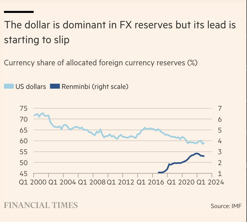
For example, this was one that circulated last week. It plots the share of reserve currencies around the world held by two currencies: the US dollar and the Chinese renminbi. Juxtaposing these two series on the same chart is clearly meant to convey a story. Anyone casually looking at this would say that the renminbi is pushing out the dollar. Just look at the rapid ascent!
But there's a trick. The graph has two y-axes, one on the left in the normal position and one on the right. Plus, they are not the same scale. If you were to get out a ruler and try to measure how much the USD line changed, then compare it to how much the Renminbi line changed, you could not make a fair comparison between the lines.
Looking at this, I wondered if I could fix it. And in doing so, I saw there were costs and benefits to different approaches. Take a look at the following graphs and let me know what you think.
The easiest fix is to put everything on the same axis. That graph isn’t very fun. It’s like seeing an inchworm in front of a mountain range.
Some people might say, “This is absolutely the right way to display the data.” But I’m not so sure. Maybe the Renminbi is responsible for the post-2016 decline in the USD. This graph is zoomed out so much that I might be missing an important story.
How can we combine proper comparisons with clarity?
Here’s a version where I return to using two axes, but I keep their scale the same. This makes for a more reasonable comparison between changes in the lines, but it still has a major fault: a casual reader might not notice the second axis and might misinterpret the conclusion. In fact, this might be worse than the original graph because, for the reader who misinterpreted the axes, the original at least kept the USD in the lead. On this one, someone might think that the Renminbi has overtaken the USD.
Have we exhausted our options?
Here’s where understanding the objective of the graph is important. What is the point of juxtaposing these two series? In my mind, we want to give readers an idea of how much China’s ascent has contributed to the decline in USD reserves. We’re likely fine ignoring some nuance, so we can make a big assumption like, “Every percentage point increase in Renminbi comes from a percentage point decrease in USD.” That’s probably not unreasonable and at least gives us an upper bound of China’s effect.
What if we proposed a counterfactual line. A line that says, “If the Renminbi stayed out of reserves, how much higher would the share of USD be?” That’s easy to calculate because our big assumption means we can add the share of Renminbi to the share of USD. Then we would get something like this.
So we’ve eliminated the second axis. But has the clarity increased? I’d be interested in what you think.
Here’s my perspective. The clear selling point of this graph is that we can see exactly where the USD would be without the Renminbi, and it’s pretty close to where it already is. There is a gap, but it’s not a very large one. My biggest complaint is that you need readers to understand that line is a counterfactual world. But hopefully the nature of the line would prompt the reader to say, “Maybe I should read the full explanation,” instead of the quicker read of, “Well, they’re on the same plot, so they must be saying the same thing.”
Overall, this post is meant to push back a little bit on some of the cardinal rules we hear spouted about graphs. “Don’t use two axes.” “Always start the y-axis at zero.” These broad rules have their benefits, but they also have their costs. When we’re visualizing data, we need to weigh those costs and benefits to see if they’re accomplishing our goals.


Great post Craig. I see this a lot (but missed the one in X which I've now abandoned). Analytical policing is underrated.
I'd be curious to see what it looks like to plot the ratio of the two lines. That'd capture the relationship trend in a single line. Of the three you provided, I definitely like the last most. The trick, as you mention, is making sure casual readers understand it's a counterfactual. Also making sure they understand the assumption being made is critical.