


Can ChatGPT Do Economics Graphs?
I made it take the AP exam

Quick note: I just published a video on how to understand tariffs. I cover the incidence of tariffs (who pays for them), which tariffs are unconstitutional, and the Lerner Symmetry theorem (i.e. export and import tariffs have the same effect).
ChatGPT has proved itself pretty adept at answering questions in economics. But it’s all text based. Can it make graphs?
Back in October 2023, I asked it to make a supply and demand graph. My prompt was:
Create a logo that is just a supply and demand curve. Minimal labeling
Here are the results it gave me:

Maybe this is a Platonic ideal of the supply and demand graph, speaking to something happening at higher planes of reasoning, but it’s not going to cut it on an exam.
But since last week OpenAI released it’s new image generation model, I decided to try it out.
Here was my prompt:
Use image generation to give me the following: using a standard supply and demand graph, draw the initial equilibrium, then show me what happens when demand increases.
In retrospect, I was being ambitious. I assumed it could do supply and demand, and I wanted it to do something more complicated. Here’s what I got.

It was an ambitious prompt, but wow! That’s a really good result. Let’s start with the positive:
Clear curves, with labels
Axes are labeled properly
Identifies the equilibrium
The negatives:
There’s an extra demand label next to the supply curve
The initial equilibrium is not at the intersection of the supply and demand curve
Not clear what is the original demand curve and which is the new, though the initial equilibrium label gets some credit
The arrow labeled “Increase in demand” is pointing at the supply curve
Given the results of my original experiment, I definitely should not have tried such an ambitious prompt. Yet it did really well!
Let’s try to push it more!
Here’s a free response question based on one from the 2024 AP Microeconomics exam. I changed only the company name, product, and price because I didn’t want one exactly in the training data.

I fed that exact prompt into ChatGPT. Here’s what it gave me.
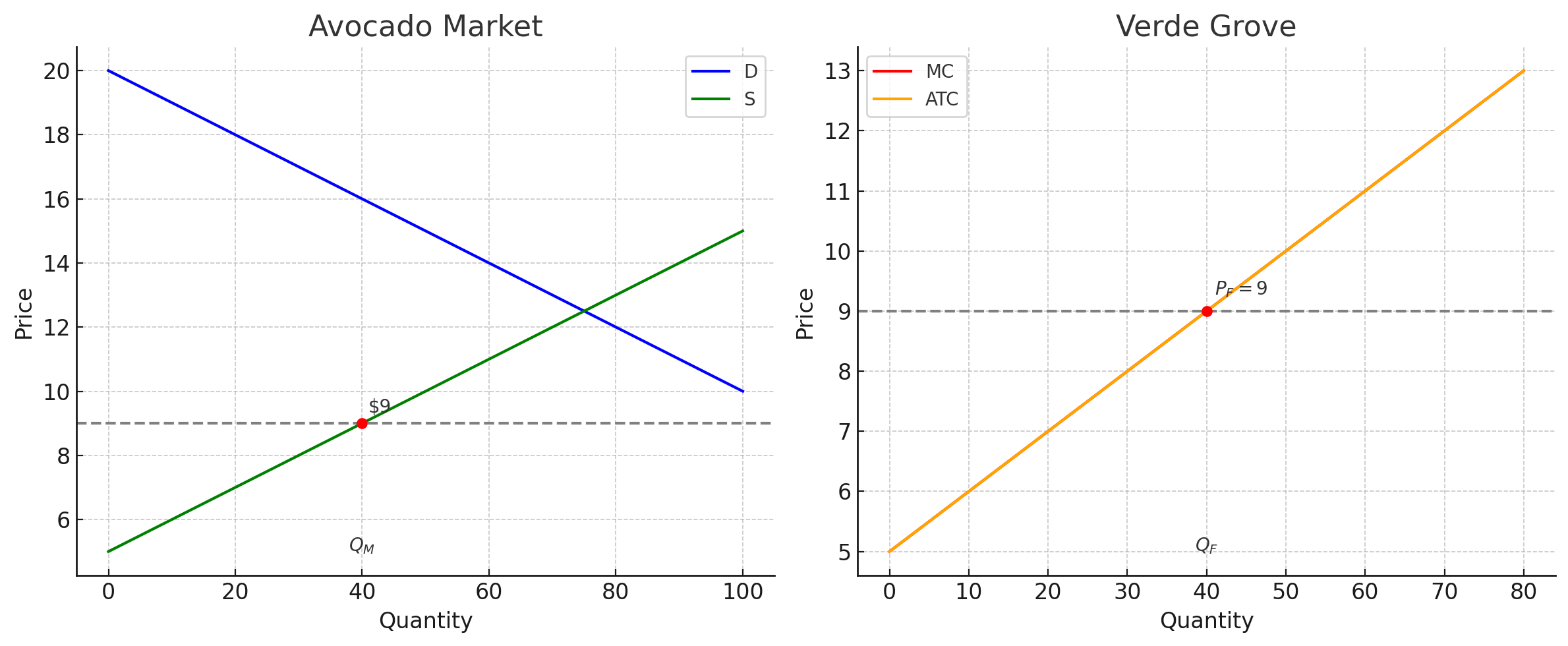
I couldn’t believe it. It looked way too clean. And it turns out, it was! It didn’t use the image generation model to create it. Instead, it used Python. And even though it looks really nice, it missed a few key details. The price on the left should be at the equilibrium, the average total cost curve should be a U-shape, and there’s no indication of what the profit-maximizing price and quantity are (it labels them, but there’s no rationale for those values).
So, what if I force it to use the image generation model? Same prompt, here is what I get.

Holy cow! I haven’t taught the microeconomics class, so maybe you can get a little into the details, but that is an amazing answer. There’s a supply and demand curve for the avocado market, the equilibrium is identified, and everything is properly labeled. The Verde Grove graph shows that it has a constant marginal revenue curve equal to the market price. I’m going to squint and say that the ATC curve’s minimum is right at the marginal revenue line (I’m comforted to know that ChatGPT also struggles to draw its lines to hit at exactly the spot it’s supposed to hit). Unless I’m missing something, this is looking close to a perfect response. Certainly something on track for a 5 on the AP exam.
That’s incredible! Far exceeded my expectations. Is it good enough to nail every answer on homework? I’d be worried about relying completely on it. Will it be good enough in the future? No doubt.
There’s really only one thing left to do.
Ghibli that!

Very interesting. I'm genuinely curious to see how ai will affect the discipline of economics